My research in this project was recognized with the UserTesting Digital Transformation Illumi Award in 2021.
Project Overview
The Problem
In 2019, The Philadelphia Inquirer’s subscription checkout flow was experiencing high abandonment rates, and we observed that mobile device conversions were significantly lower than desktop. To address this, we needed to take a comprehensive approach to understand and resolve the issues within the checkout process. Due to a growing mobile user base, it was imperative to introduce a checkout flow that better served their needs.
A scene from Brooklyn Nine-Nine where Jake’s attempt to surprise Amy with a romantic online mattress purchase goes hilariously wrong.
UX Strategy
Given the significance of subscriptions to our revenue stream, we focused heavily on research in the early stages of design. We prioritized the redesign of the digital checkout to gather insights that could subsequently inform the redesign of the more complex print subscriber checkout flow.
Research
I served as the product designer and researcher for this project, and took a two-step approach to solving the problem:
- I examined the Baymard Guidelines (research backed UX insights and best practices) to better understand most common UX problems and industry best practices.
- This was followed by auditing our own checkout flow to determine the friction points.
The checkout had several issues:
- It did not comply with accessibility standards.
- The site seemed unsecure to users as payment methods were not listed and it was lacking secure icons or user cues.
- The language was impersonal.
- Subscription perks and payment details were unclear.
- The checkout form was too long.
- Form input labels and error messages were unclear.
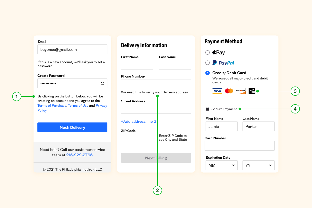
Based on my findings, I made drastic changes, which I wanted to validate before the engineering team spent valuable hours building it. So I built a simple prototype using HTML, CSS and javaScript and conducted a usability study with 10 participants on mobile devices. The results were a success—all the participants went through the new flow easily and quickly. They appreciated how easy it was to fill and edit the forms, they found the subscription perks and payment details clear, and most importantly they perceived the site as secure.
I also discovered through the usability study that customers are more likely to subscribe if they know they have the option to cancel online. Additionally, participants expressed a desire for social sign-on and third-party payment options, which were not available at the time.
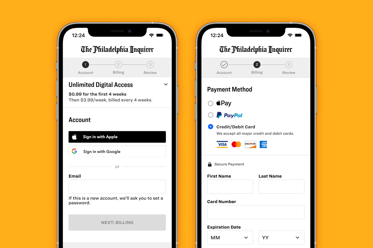
Design
The checkout flow was significantly updated based on research and validated designs. Key enhancements and their outcomes are shown below.
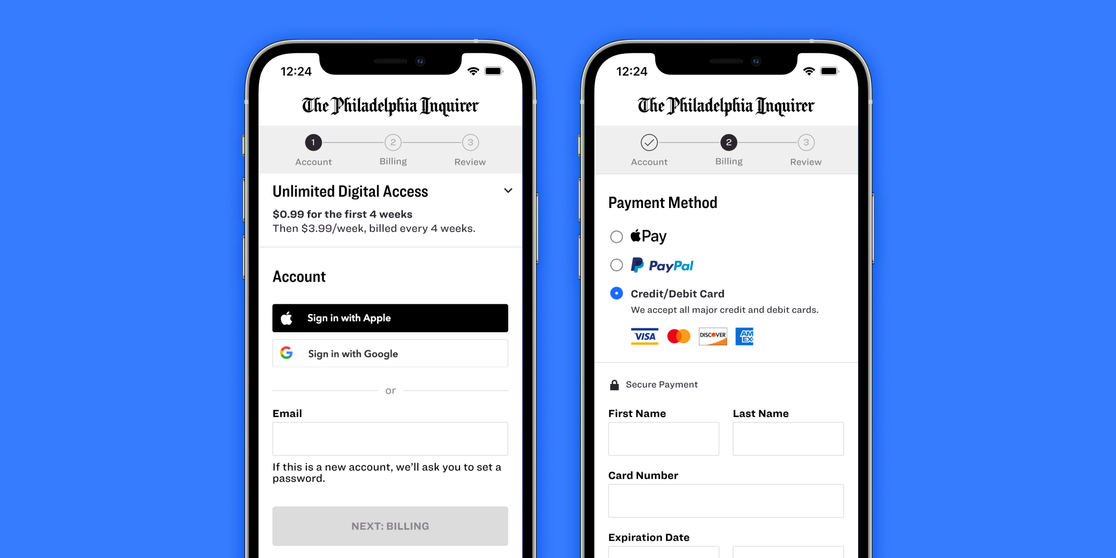
Improving trustworthiness
- Prominent privacy policy and terms and conditions links boosted user trust by addressing data concerns and clarifying rights and responsibilities.
- Explained why seemingly unnecessary personal data (like a phone number) is required.
- Users perceived the credit card logos as trustworthy.
- The lock icon made the users think the site is secure.
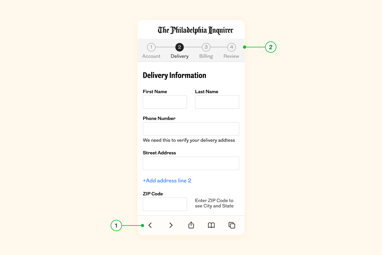
Form optimization
We optimized the flow by shortening the form, removing unnecessary questions, providing clear labels, and hiding optional fields behind links. We pre-filled input fields with known information and selected the text when users tapped the field so they could easily edit it. Additional improvements included the following.
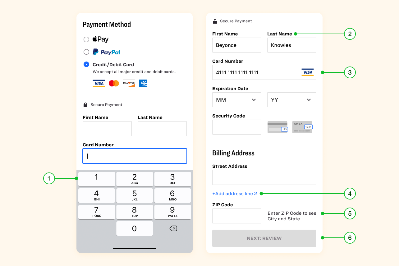
- Improved usability by displaying number keyboard for number only fields.
- Since most fields are required, instead of labeling required fields we clearly called out optional fields.
- The credit card fields automatically recognized and formatted the card type, eliminating the need for users to enter spaces between numbers or specify the card type.
- Hiding the second address line behind a link to reduce cognitive load.
- Auto-detecting the city and state when the ZIP code is entered allows users to move faster by entering less information. Hiding additional fields helped reduce cognitive load.
- Keeping the subscribe button sticky on the bottom to ensure it’s always visible.
Error handling
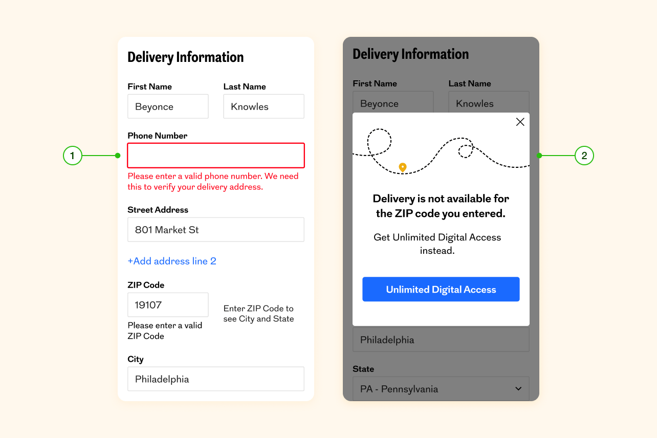
- Our error handling was too generic and unhelpful, and the fields that had rules were unclear. So we provided clear assistive text when needed to prevent errors (e.g. password) and wrote specific error messages that tells users what they need to do. We also validated input fields when they exit the field so they’re not overwhelmed.
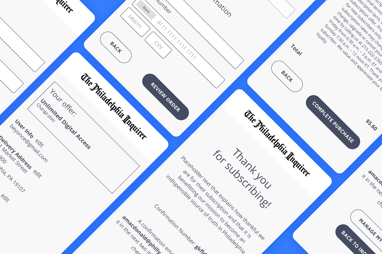
- We added delightful moments when appropriate. For print subscriptions, we needed to handle scenarios where users change their address mid-process. Instead of a standard red error message, I used Adobe After Effects to create an animation of a truck unable to reach its destination, and we directed users to the digital subscription checkout flow.
Accessibility
To enhance accessibility, we have taken several steps. First, we've made it possible to navigate all interactive elements using only a keyboard. We've implemented a clear HTML structure that is compatible with screen readers and used <label> element for form labels and added clear description. We've also incorporated ARIA label attributes to clarify page layout and error messages, and provided skip to main content links for users who wish to bypass navigation. Finally, we've added alt text to all images, and double-checked color contrast to ensure that it meets accessibility guidelines.
Navigation
Credit card logos and the lock icon made users think the site is secure and trustworthy.
- To prevent users from accidentally leaving the checkout process, we made sure the browser back button functioned correctly within the flow.
- We incorporated clear progress indicators and action-oriented text for call-to-action buttons.
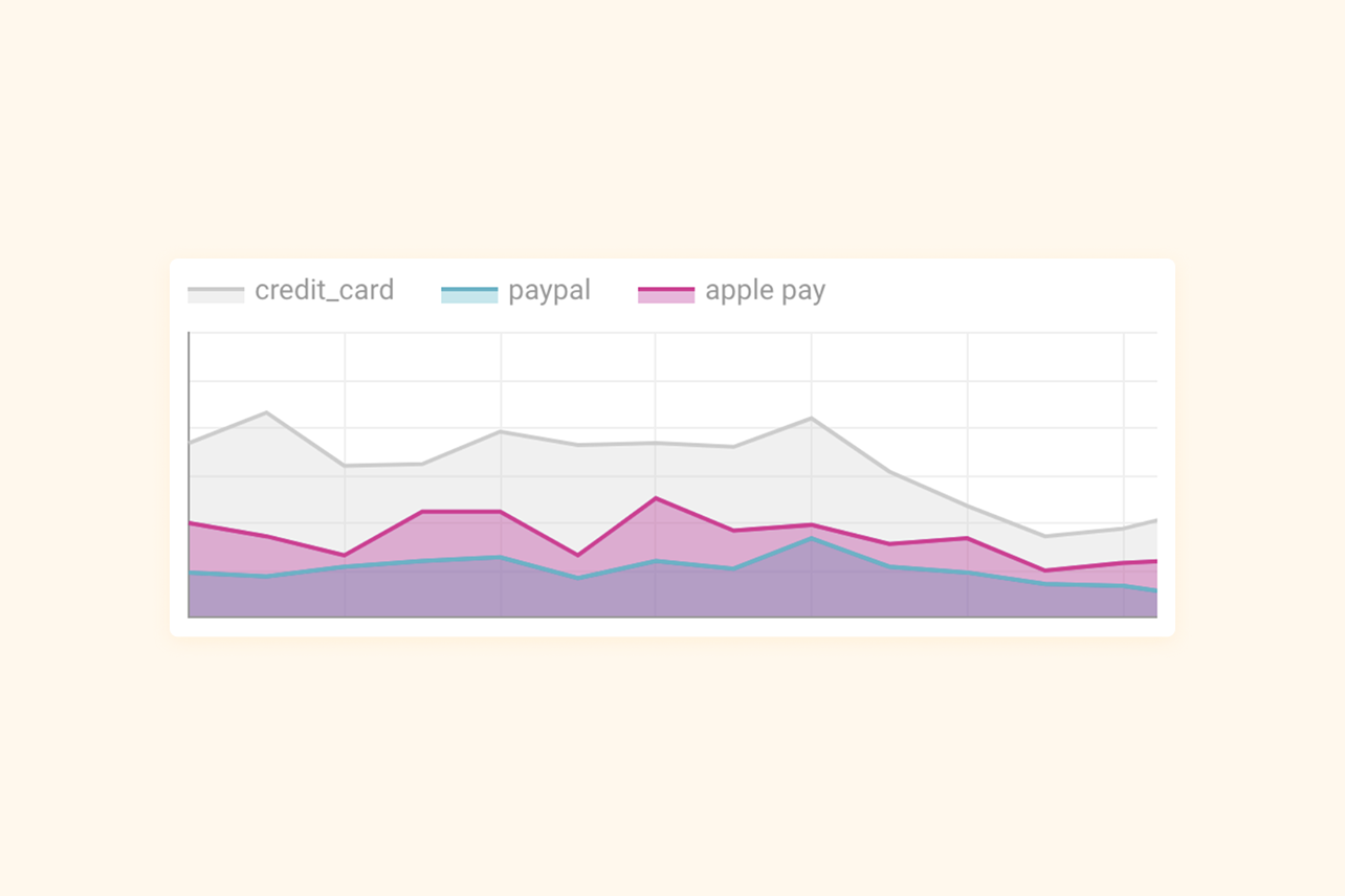
Payment methods
Offering third party payment options such as PayPal and Apple Pay increased checkout completion rates.
Review and confirmation
We optimized the review step for easy skimming, ensuring users could quickly confirm key details like subscription type, billing amount, and payment details.
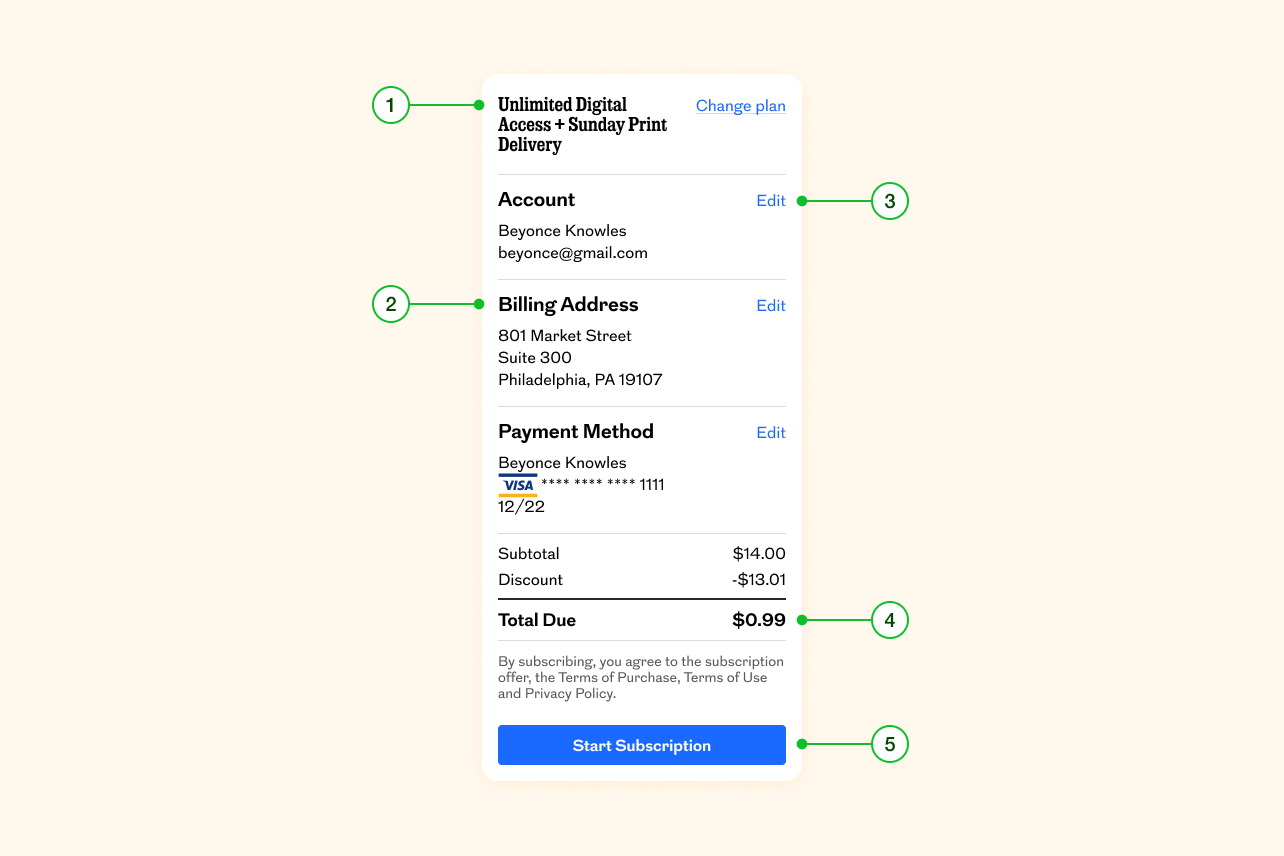
- Subscription type can be viewed and changed here.
- Users can review submitted information before subscribing (email address, delivery address, payment method).
- Users can edit information directly at the review step.
- The order total is made the most prominent price, and a cost breakdown is provided.
- "Start Subscription" button is sticky on the bottom to ensure visibility.
A comprehensive list of all the major improvements we did can be found in this checklist. I originally prepared this checklist for the talk Lindsay Grow and I gave at NPA 2024 on “Award-winning checkout—How we supercharged our completion rate, and you can, too.”
The Outcome
The redesign resulted in a remarkable 68% increase in checkout completion rate on mobile devices and a 24% increase across all devices.
Key Learnings
- Clearer pricing and cancellation terms build trust.
- Small UX tweaks (like clear labels and better field validation) had outstanding impact.
- Security indicators increase confidence.
- Cross-functional collaboration was key to success.
What’s Next?
Given the success of our digital subscription checkout redesign, we immediately redesigned our print subscription checkout as well. I shared some tidbits about our decision making for that above.
Four years later, we noticed abandonment at checkout again and needed another major improvement. Our Senior Product Designer Jenn Bateman and I conducted moderated user interviews using our then-current digital checkout. Based on our discoveries, Jenn revamped the digital subscription checkout. We will eventually update the print checkout as well. Until then, you can see Jenn’s digital checkout and my original print checkout live.