Project Overview
The Problem
Live blogs deliver real-time news updates for ongoing events, such as sports, politics, and music. When Lindsay Grow designed our first Live Blog in 2019, The Philadelphia Inquirer became one of the only local newspapers with a live blog in the United States. As we tracked metrics over time, we recognized a need for improvement, particularly to enhance the mobile user experience and make the live blog easier to use for mobile users who are looking for breaking news events.
The revamped live blog design aimed to improve the reader experience, making the format adaptable to different story types, and expanding its use beyond the breaking news desk.
UX Strategy
Our goal was to create a better user experience by addressing key areas identified below through qualitative and quantitative data.
- Mobile users had difficulty navigating and getting to the first post quickly.
- Engagement with individual post sharing was low.
- Users tended to scroll less in live blogs with longer posts.
- The timeline feature saw low engagement, especially on mobile devices.
This included a mobile-focused visual redesign. The following feature changes were key elements of our strategy:
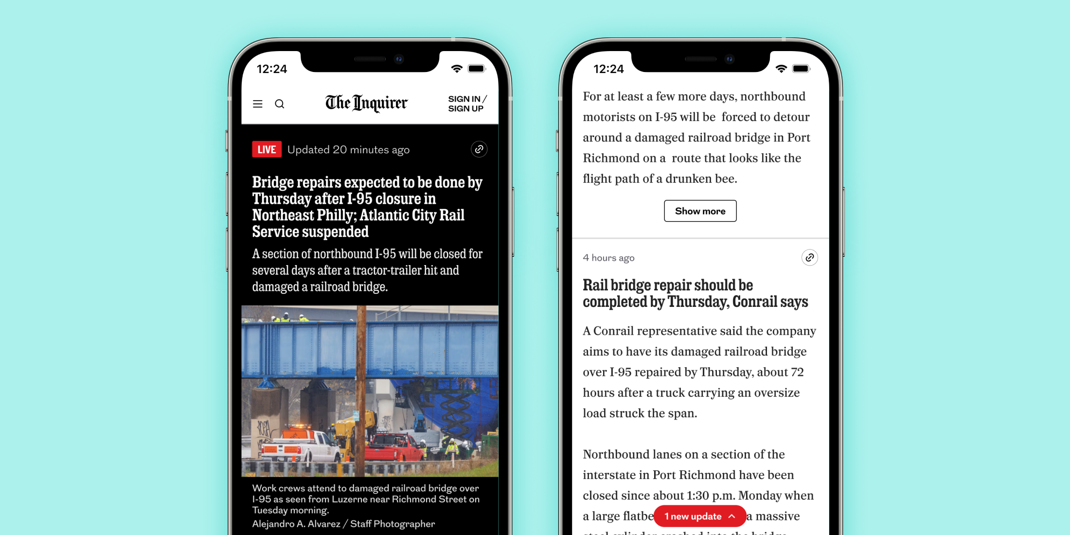
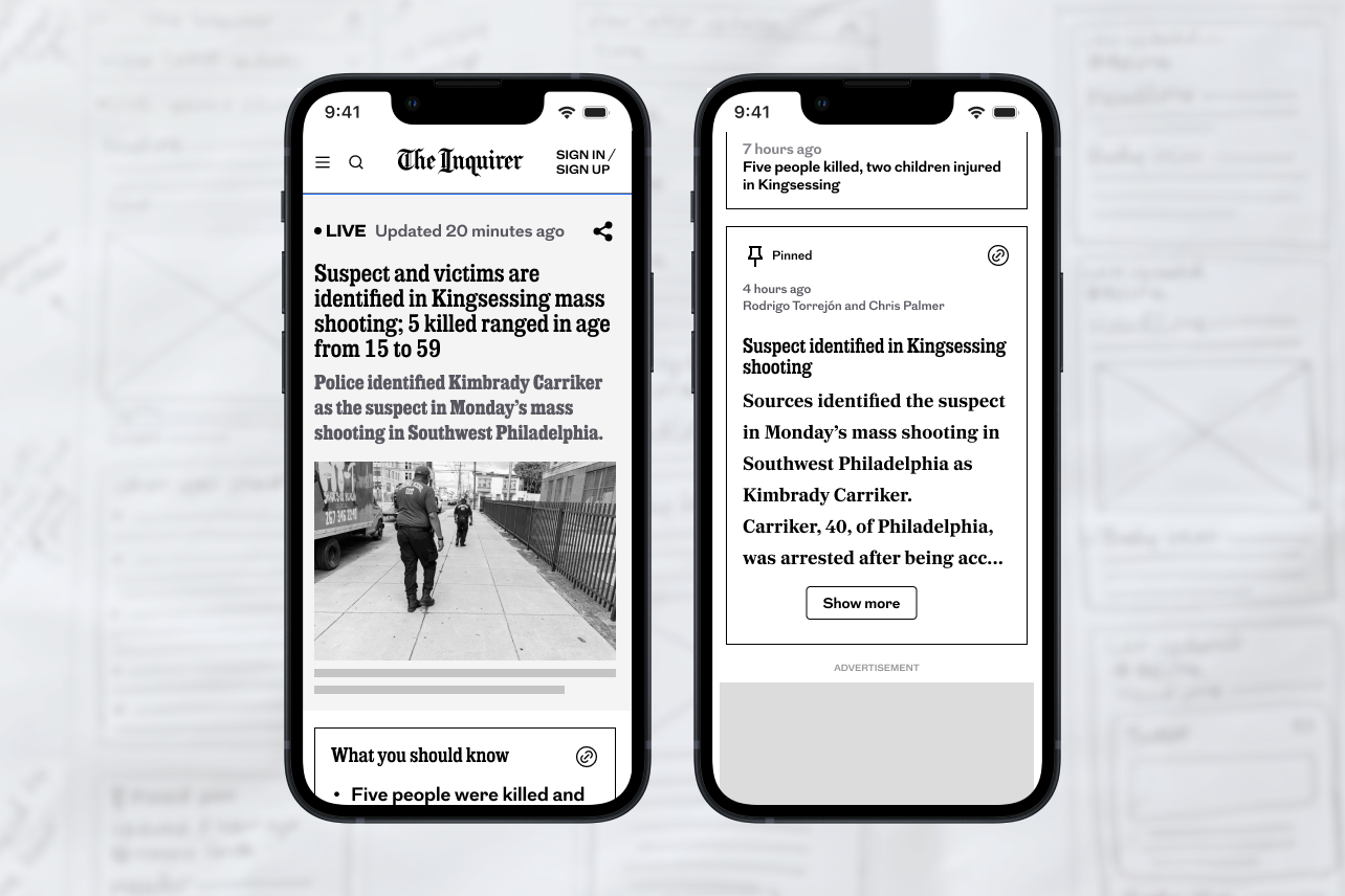
- Added the ability to alert users of new updates and introduced pinned posts to highlight important updates
- Improved social sharing by adding a copy share link icon instead of hiding sharing options behind an ellipsis
- Enabled collapsible long posts for improved readability
- Removed the underperforming timeline
To ensure our changes were effective, we prioritized rapid usability testing and validation to quickly iterate and refine the experience.
Design
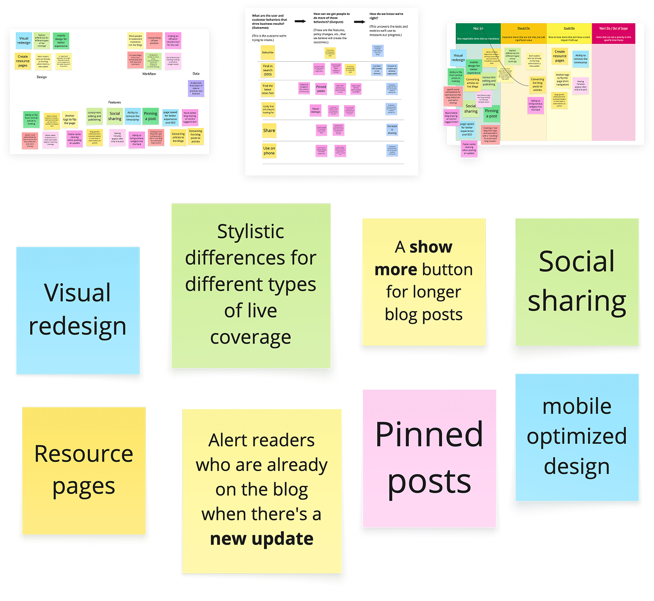
I began with a comparative analysis to identify best practices, ensuring our approach aligned with industry standards. I examined the live blogs of The Washington Post, The New York Times, Politico and The Guardian and found that they all had a quick recap on top, pinned posts for new developments, ability to share each post individually and alerts that let users know of new posts.
Using these insights, I sketched and wireframed new designs focused on key UX improvements. To quickly validate our ideas, I created interactive prototypes and collaborated with our research team to test them.
My primary focus was improving the UX so I started with removing the timeline which was performing poorly based on tracking metrics.
Research
I handed off the wireframes to our Senior UX Researcher, María Elizabeth Rodríguez Beltrán, who then conducted unmoderated usability tests with 14 participants to gather insights and validate key design changes to the live blog on both mobile and desktop.
The research focused on four key areas:
- Assessing the usability of the new "pinned" function above the "latest" box.
- Evaluating the effectiveness of the updated shareability features.
- Testing the clarity of renaming "timeline" to "live updates."
- Identifying potential user fatigue caused by the volume of information.
Findings showed that participants perceived the pinned post as the most important or relevant update, regardless of its recency. Participants loved the page layout and thought the amount of information was well-balanced. The sharing function was generally understood. These insights validated key design updates that improved clarity and usability.
The Outcome
By creating a more engaging and seamless experience, the redesign helped retain search-driven traffic and ad revenue while enabling more teams across the newsroom to leverage the format for real-time coverage.
Adapting the Tool for the Sports Desk
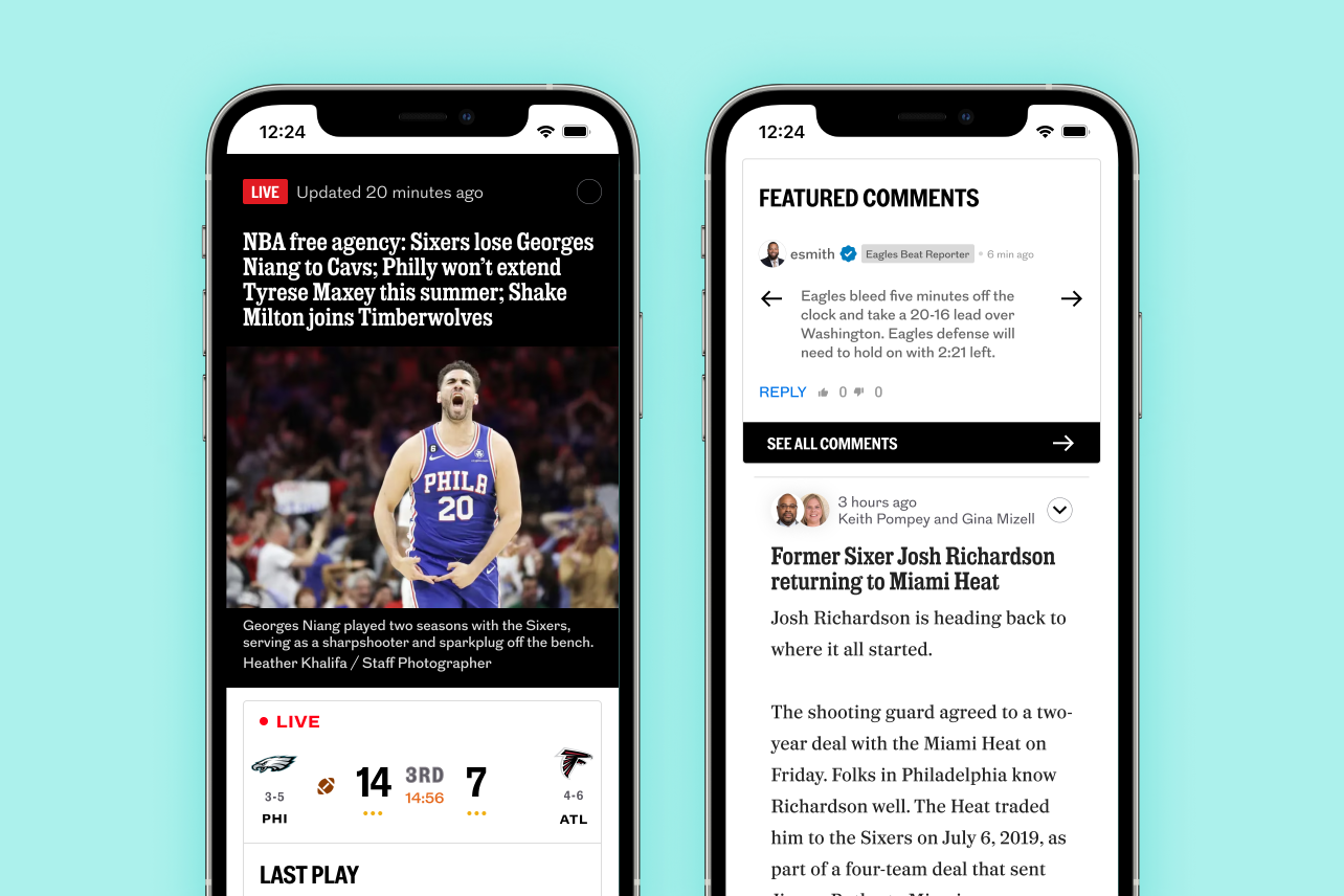
After we successfully launched the updated live blog, I adapted it for the sports desk by separating sports blogs from news blogs and incorporating more sports-centric features such as scorecards, featured comments and betting odds widget. Additionally, I made the byline more prominent for sports writers to highlight different personalities and viewpoints, which are more important for Philly sports fans than news readers.
Key Learnings
Our estimated timeline was off due to priority conflicts with other projects, which caused delays across multiple sprints, and the need to significantly upgrade the beta tool after qualitative testing revealed frequent instability in the first version.
Even though the project successfully achieved its goals of audience growth and more live blog views, we observed that recirculation, particularly on mobile, slightly decreased. We believe this is due to the "show more" button, which covers links that could encourage recirculation.
What’s Next?
To address the decrease in recirculation, we’ve released the mini-nav and are continuing to iterate the "show more" experience. In addition, we are closely tracking the performance of the “what you should know” box, evaluating whether it should be replaced with a pinned post based on its performance. This ongoing analysis will help us optimize the user experience and content delivery.
We also developed custom internal tooling for various story formats, including live blogs. To learn more about how we built and refined our live blog tooling, check out Live Blog Tooling (case study coming soon).